Procurement Analytics Dashboard Using ChatGPT
Struggling to turn scattered purchase orders, invoices, and supplier lists into a story you can act on? In this guide, you’ll build a Procurement Analytics Dashboard with ChatGPT in 10 minutes—from a blank page to an interactive view of total spend, top suppliers, contract utilization, payment status, and more.
We’ll prompt ChatGPT to generate clean, copy-pasteable HTML/JavaScript using Plotly and (optionally) SheetJS, so you can upload Excel/CSV/JSON files and instantly get KPIs, trend charts, maps, and scorecards—no heavy BI setup required. Whether you’re a procurement lead, analyst, or founder, you’ll learn how to transform raw data into insights that spotlight savings opportunities, expose risk, and speed up decisions. Ready to go from “where’s the data?” to “here’s the plan”—fast?
Table of Contents
Create Sample Data
Create an excel file where column header names and some sample data is present. The excel structure (column names/data type) should match with your actual data.
ChatGPT Prompt-1
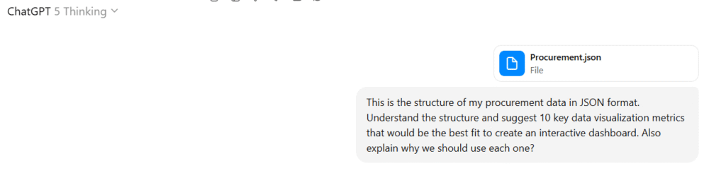
Open ChatGPT and Upload your sample data file to chatGPT and say: “This is the structure of my procurement data in excel format. Understand the structure and suggest 10 key data visualization metrics that would be the best fit to create an interactive dashboard. Also explain why we should use each one?
Note: In below snapshot i used JSON format. Don’t worry about it, just go ahead with the above prompt
ChatGPT will provide you the proposed Dashboard Metrics.
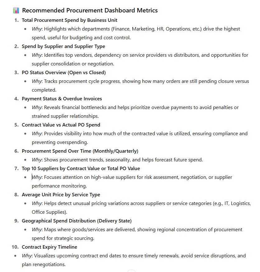
Please review and ask it to change if required (for example ask it to change certain KPIs or visuals types such as heatmaps, bar graph, donut chart, pie chat, funnel chart etc)
ChatGPT Prompt-2
Once you are satisfied with above feedback from ChatGPT, please give this prompt: “Now, I want you to create an interactive Procurement dashboard with the key visualizations using HTML and JavaScript. Use the latest version of Plotly.js CDN and include an upload feature so that we can upload the Excel file. It should generate the dashboard based on the uploaded data. Note: I need to upload the data from my local computer, and it should create the dashboard based on that data. Once done, please give me the output in downloadable HTML File”
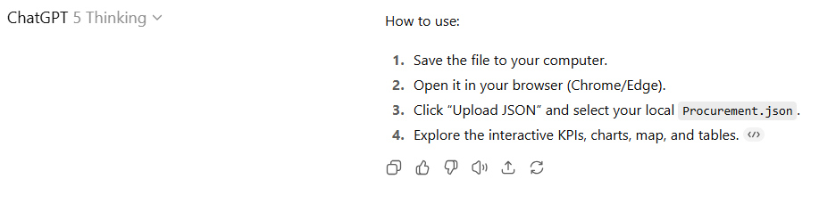
ChatGPT will take some time depending upon the complexity of your data (number of columns, data types, dashboard requirements finalized in previous step). After a while, ChatGPT will give you an HTML file to download and will provide following instructions. In below snapshot it says Procurement.json but in your case it would say “Upload Excel” since we gave the instructions for Excel in previous prompt:
Final Step: Generate Dashboard
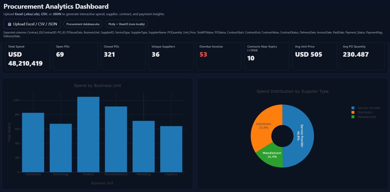
Double click the HTML file that was produced by ChatGPT to open in your browser. You will see something similar to below:
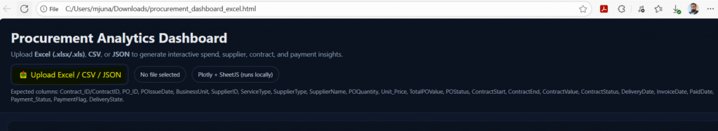
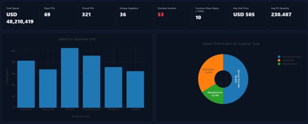
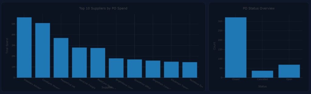
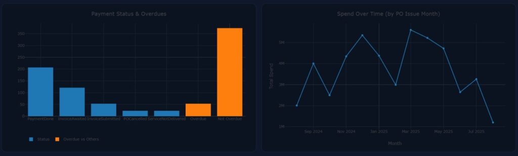
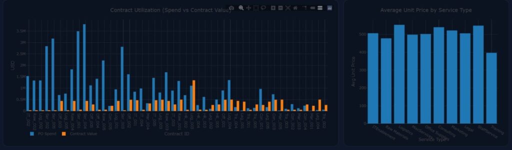
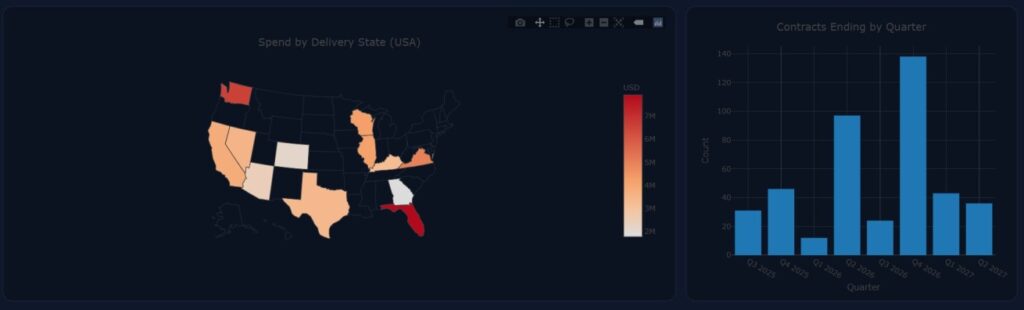
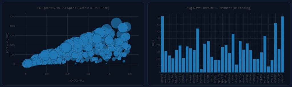
Click on Upload Excel and boom! dashboard is ready ! Here are some snapshots.
Tip: Hover your mouse to different areas on the graph and it will show you the values/insights and associated information
Pro Tips for Customizing Your Dashboard
- Hover to reveal details — tooltips show exact values, dates, suppliers, and more.
- Click legend items to isolate/compare — toggle series on/off to focus on what matters.
- Drag to zoom; double-click to reset — explore spikes or outliers quickly.
- Use the toolbar (top-right) — pan, lasso/box select points, and download a PNG via the camera icon.
Customize visuals (with ChatGPT prompts)
- Ask ChatGPT to match your brand — “Use our colors: #0A6FFF, #00C389, #1A1A1A; font: Inter.”
- Request preferred chart types — “Make spend distribution a donut,” “Use a horizontal bar for long supplier names,” “Show cumulative spend as an area chart.”
- Add KPI thresholds & highlights — “Color KPIs red if overdue invoices > 10, amber if 5–10.”
- Add annotations — “Label the spike in March with ‘New contract onboarding.’”
Filters & controls (easy wins)
- Add slicers — dropdowns for Business Unit, Supplier, and a date range to filter all charts.
- Top-N toggle — let users switch between Top 5/10/20 suppliers for performance and clarity.
- Unit switcher — button to view spend in USD / AED / EUR (with a static conversion table).
Data prep tips
- Keep numbers clean — remove currency symbols and commas; store as pure numbers for accurate sums.
- Standardize dates — use
YYYY-MM-DDor3-Oct-2024style; Excel serial dates are supported. - Normalize headers — use consistent names (e.g.,
ContractID,PO_ID,TotalPOValue); the template already maps common variants.
Performance & UX
- Pre-aggregate by month for time series and limit categories (e.g., top suppliers + “Other”).
- Defer heavy charts — render below-the-fold visuals after upload for a snappier first paint.
- Use readable labels — rotate long axis labels or switch to horizontal bars to avoid overlap.
Sharing & exports
- Export filtered data — add a “Download filtered CSV” button (SheetJS can export what’s on screen).
- Snapshot reports — add a “Download dashboard as PNG” helper that captures key charts together.
Accessibility & inclusivity
- Color-blind friendly palettes — ensure contrasts; avoid relying only on color for meaning.
- Descriptive titles & alt text — make charts understandable in screen readers and for quick scanning.
Troubleshooting
Map not coloring states? — ensure DeliveryState has full US state names (e.g., “California”), not abbreviations (the code maps names → codes).
If a chart looks blank — check for typos in column names, non-numeric values in number fields, or a filter that hides everything.
Please send an email to editor@exceediance.com if you would like to have this HTML file and sample data to play with.
Recommended Articles
- Free Online Bar Chart Video Maker — 2 Minutes, No Sign-Up – Exceediance
- Build a FREE Online Gantt Chart in Minutes – No Excel, No Sign Up Needed – Exceediance
- IT Defects Management Dashboard Power BI Template Stunning Visuals – Exceediance
Procurement Dashboard Using Lovable
Click here to expand this dashboard and interact it to see this in action