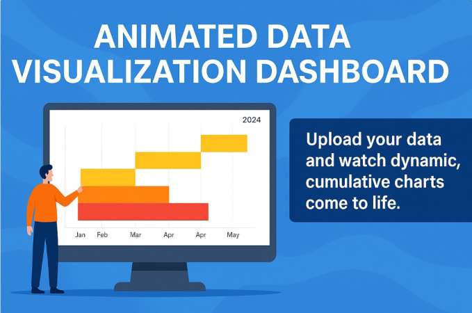
Free Animated Data Visualization Dashboard for Dynamic Business Insights
Table of Contents
Data is the new oil — but raw data alone doesn’t drive decision-making. To truly benefit, it must be transformed into visual insights that are clear, engaging, and intuitive. That’s exactly what the Animated Data Visualization Dashboard offers. All processing is done on the client side — no server storage or data upload. It’s secure, fast, and lightweight.
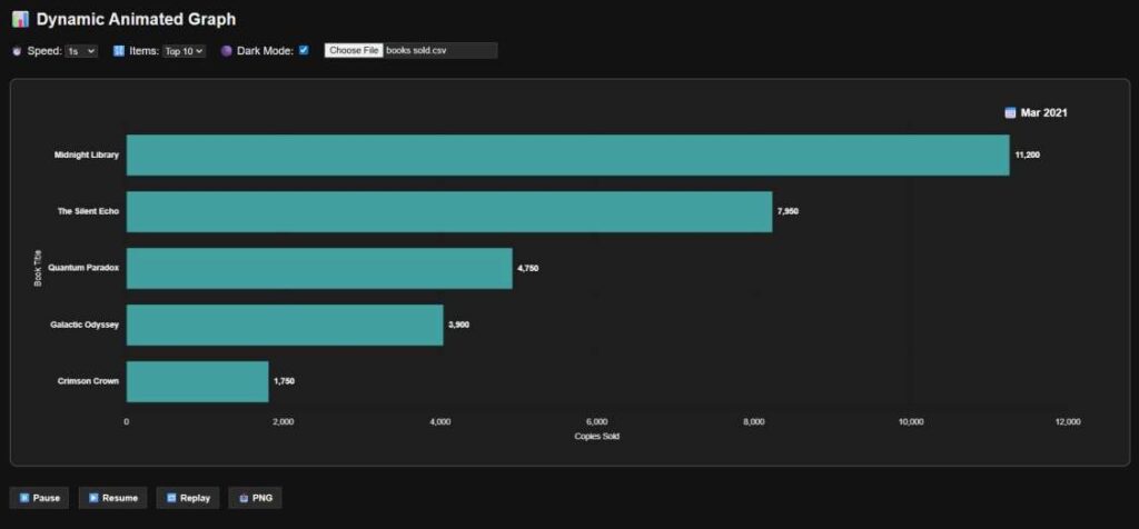
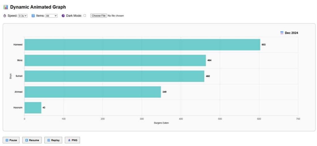
Designed with flexibility, interactivity, and clarity in mind, this powerful tool allows users to upload their own datasets and instantly watch animated, cumulative horizontal bar charts come to life. Whether you’re tracking book sales, car purchases, burger consumption, or foot traffic, this dynamic chart adapts to any data type and provides month-over-month progression with seamless animation.
Features at a Glance – Free Animated Data Visualization
Key Functionalities
Feature Description Universal Compatibility Accepts any 3-column CSV (Date, Category, Value) Custom Speed Control Choose animation pace from 0.3 to 2 seconds Top-X Filtering Display top 5, 10, or more items based on cumulative values Real-Time Cumulative Display Visualizes growing values month-by-month with auto-sorting Always-Visible Mini Control Panel Intuitive interface with Play, Pause, Replay, PNG export & Dark Mode Dark Mode Toggle Switch between light and dark themes effortlessly Export as PNG Save the final visual for reports, presentations, or documentation
Why Use This Tool?
This dashboard goes beyond static charts. Here’s how it helps:
- Simplifies complex data into easily understandable animated visuals
- Tracks growth trends over time (e.g., product adoption, revenue, or sales)
- Ideal for reporting, presentations, and executive dashboards
- Encourages real-time storytelling through smooth progressive visuals
Use Case Examples
Here are just a few practical scenarios:
- Marketing Teams: Visualize product launches and campaign impact
- HR Departments: Track headcount growth per team or location
- Startups: Showcase monthly active users (MAUs) across platforms
- Retail Stores: Compare seasonal sales across product categories
- Restaurants: Highlight best-selling items month-over-month
How It Works
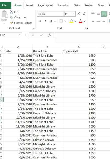
- Upload your CSV file (must include 3 columns: Date, Category, and Value) As shown in below image
- Choose your desired animation speed
- Set how many top items you want to display
- Watch the chart animate — with monthly cumulative totals
- Use the control panel to pause, replay, or export as PNG
- Toggle Dark Mode for better visibility in different settings
Convert Excel to CSV (Step-by-Step)
Option 1 – Using Microsoft Excel
- Open your Excel file (.xlsx)
- Click on File > Save As (or press F12)
- Choose the location to save
- In the “Save as type” dropdown, select: CSV (Comma delimited) (*.csv)
- Click Save
Note:
- If your workbook has multiple sheets, only the active sheet will be saved.
- Save each sheet separately if needed.
Best Practices:
- Make sure your Excel file has only 3 columns: Date, ProductName, NumericValue
- Avoid formulas – use actual values
- Format your Date column as YYYY-MM-DD or any consistent format
Tech Behind the Tool
This chart is built using:
- Chart.js for chart rendering
- JavaScript for animation and cumulative logic
- PapaParse for client-side CSV parsing
- HTML/CSS for layout and dark mode switch
All processing is done on the client side — no server storage or data upload. It’s secure, fast, and lightweight.
See YouTube Video – How It Works
Try It Now
Simply scroll up, upload your file, and start visualizing your data.
To maintain best performance and readability, the chart defaults to the top 10 products — but you can customize it as needed.
Dynamic Animated Graph
We’d Love Your Feedback
f you have feedback, feature requests (video download option, Microsoft Excel xls file support, company logo display, chart types) or encounter any issues, please write to:
Your insights help us shape the future of data visualization tools for professionals like you.
Some Fun Articles
- Business Name Generator – Get Unique Ideas Instantly ! – Exceediance
- Interactive Dashboard for An IT Company – Exceediance
- IT Defects Management Dashboard Power BI Template Stunning Visuals – Exceediance
1 comment
[…] Free Animated Data Visualization Video Dashboard in 2 Minutes – Exceediance […]