Power BI dashboard will help you many ways. Tracking the progress, analyzing the performance, identifying poor areas, preparing strategies for new products, services and human resources. You may want to check out of 15 Important FAQs about Business Analytics
With Power BI, you can visualize your data in many ways, such as Gantt Chart, Stack Chart, Cluster Chart, Sunburst Chart, Bar Chart, Pie Chart, Donut Chart, Time Race Visualization, Scattered Chart, Tree Map, Waterfall Chart, Key Influencers / KPI Measurements, Comparison reports, Maps Display, Speedometer Gauge, Calendar Charts, Chicklet Slicers, Histograms and Radar Chart.
19 Data Analytics Visuals, Graphs and Charts
Table of Contents
1- Gantt Chart
A Gantt Chart visually represents project schedules, displaying tasks along a timeline. It illustrates task dependencies, durations, and the overall project timeline
Use When: Managing project timelines, tracking task dependencies, and visualizing project schedules over time. Ideal for project managers and teams to plan and monitor project progress
2- Stack Chart:
A Stack Chart displays multiple datasets stacked on top of each other, illustrating the total and individual contributions of each dataset to the whole.
Use When: Illustrating the contribution of individual components to the whole. Useful when showcasing how parts make up the entirety of a dataset
3- Cluster Chart:
Cluster Charts organize data into clusters, helping identify patterns or trends within each cluster. They are useful for comparing groups of related data points
Use When: Comparing groups of related data. Ideal for identifying trends within each cluster and understanding patterns across different groups.
4- Sunburst Chart
Sunburst Charts visualize hierarchical data using concentric circles, making it easy to understand relationships and proportions within nested categories.
Use When: Representing hierarchical data with nested categories. Effective for displaying proportions within each category and their relationships.
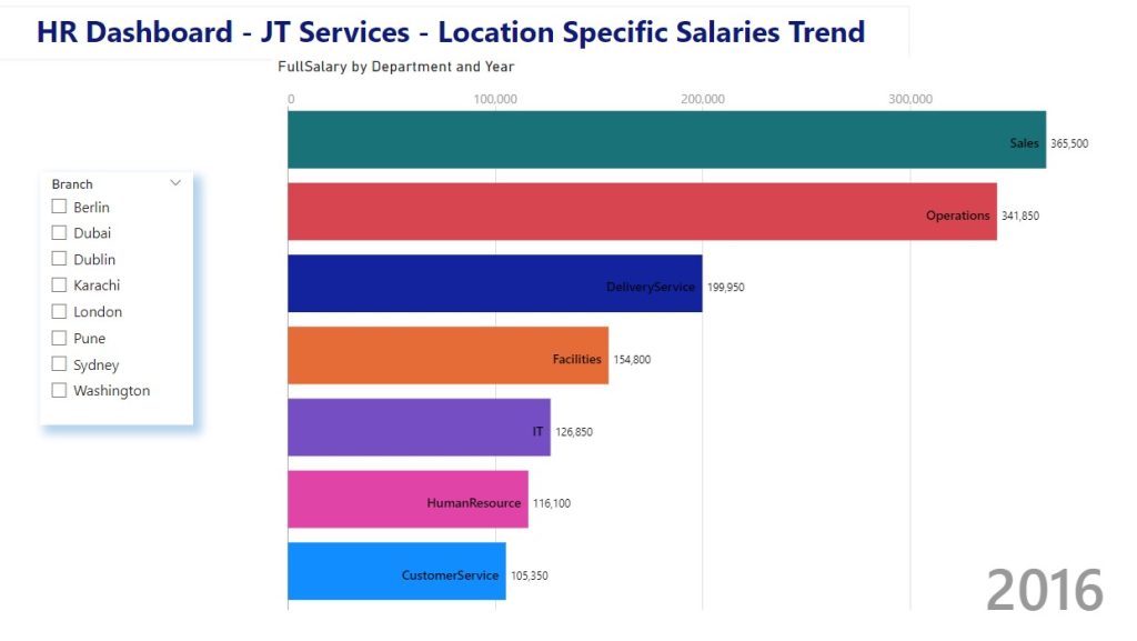
5- Bar Chart
Bar Charts represent data using rectangular bars, where the length of each bar corresponds to the value it represents. They are effective for comparing values across categories
Use When: Comparing values across different categories. Well-suited for presenting discrete data points and showing the magnitude of each category.
Lets continue on our article about 19 Data Analytics Visuals – Graphs and Charts
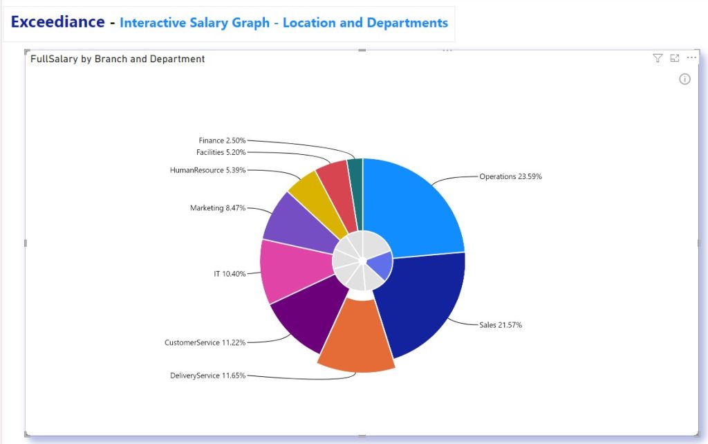
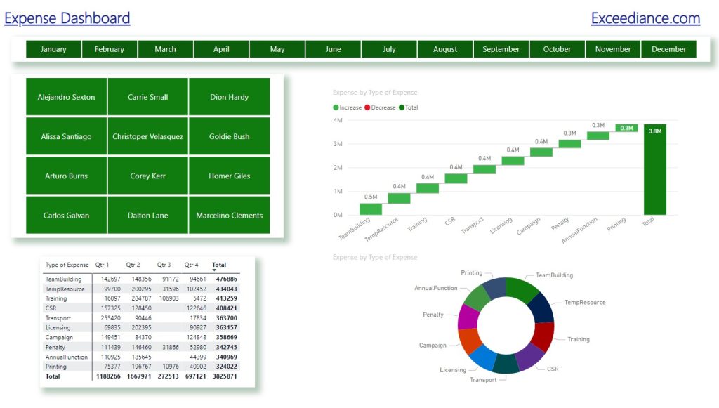
6- Pie Chart
A Pie Chart displays data as slices of a circular pie, representing parts of a whole. It’s useful for showing the proportion of different categories
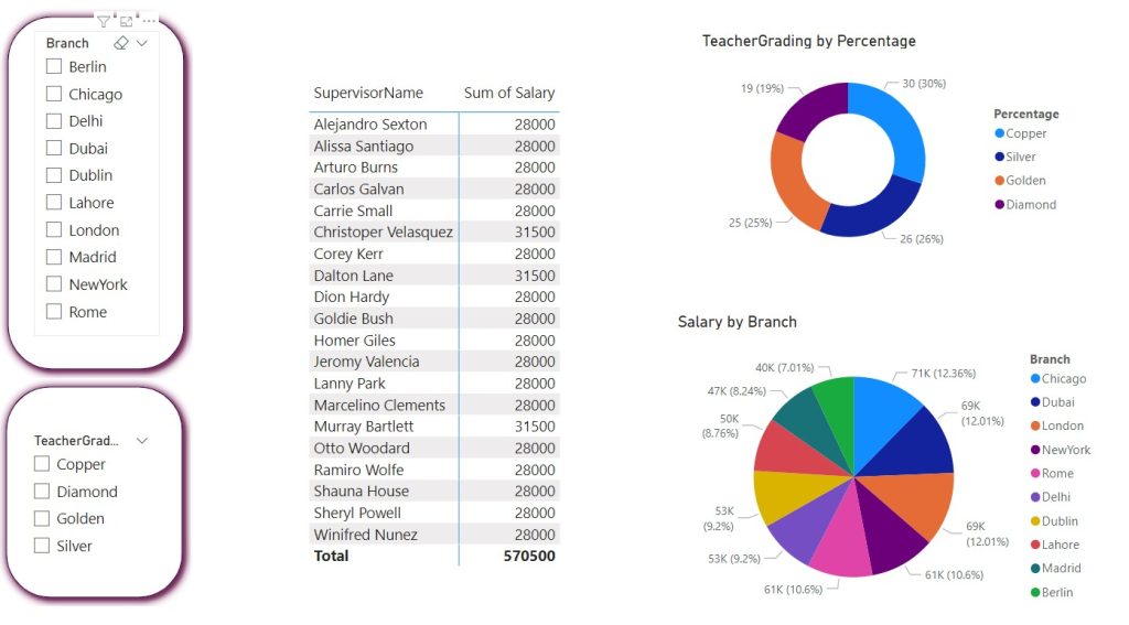
Use When: Highlighting the proportion of parts to a whole. Suitable when emphasizing the percentage distribution of categories within a dataset.
7- Donut Chart
Similar to a Pie Chart, a Donut Chart also represents parts of a whole, but with a hole in the center. It provides a cleaner look and allows for additional information in the center
Use When: Providing a clean representation of parts to a whole, similar to a Pie Chart. The central hole can be used for additional information or context.
8- Time Race Visualization
Time Race Visualization animates data changes over time, making it dynamic and engaging. It’s effective for showing trends, especially in time-series data.
Use When: Animating data changes over time to show trends dynamically. Engaging for time-series data analysis and storytelling.
9- Scattered Chart
A Scattered Chart displays individual data points as dots on a graph, helping identify correlations or trends between two variables
Use When: Identifying correlations or trends between two variables. Effective for visualizing relationships and detecting outliers in data.
10- Tree Map
A Tree Map visualizes hierarchical data using nested rectangles, with each branch representing a category. The size of the rectangles corresponds to the data values
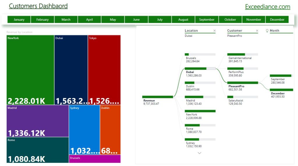
Use When: Visualizing hierarchical data with nested rectangles. Useful for displaying the hierarchical structure and size of each category.
11- Waterfall Chart
A Waterfall Chart illustrates the cumulative effect of sequentially introduced positive and negative values. It’s commonly used for financial data or project analysis.
Use When: Illustrating the cumulative impact of sequential positive and negative values. Ideal for financial analysis and understanding the flow of data.
Lets continue our article about 19 Data Analytics Visuals – Graphs and Charts
12- Key Influencers / KPI Charts
Key Influencers or KPI Measurement visualizations identify factors that significantly influence key performance indicators (KPIs), helping in data-driven decision-making.
Use When: Identifying factors influencing key performance indicators (KPIs). Valuable for decision-making based on critical influencers.
13- Comparison reports
Comparison Reports visually present and compare data across different categories or time periods, aiding in trend analysis and decision-making
Use When: Comparing data across different categories or time periods. Useful for trend analysis, performance evaluation, and making informed decisions.
14- Maps Displays
Maps Display visualizes geographic data, allowing users to understand spatial patterns and trends. It’s useful for regional analysis and location-based insights
Use When: Visualizing geographic data and understanding spatial patterns. Ideal for location-based analysis and regional insights.
15- Speedometer Guage
A Speedometer Gauge represents a single value within a range, similar to a car’s speedometer. It provides a quick visual indication of performance against a target
Use When: Indicating the performance of a single value against a target range. Suitable for quick visual assessment of performance metrics.
16- Calendar Charts
Calendar Charts display data across dates or time periods on a calendar grid, making it easy to identify patterns or trends over time
Use When: Displaying data across dates or time periods on a calendar grid. Helpful for identifying trends and patterns over time.
17- Chicklet Slicers
Chicklet Slicers are interactive buttons or icons that allow users to filter data in dashboards easily. They enhance the user experience in data exploration
Use When: Creating interactive dashboards with user-friendly data filtering. Enhances the user experience in exploring and analyzing data.
18- Histograms
Histograms represent the distribution of a dataset by dividing it into bins or intervals, displaying the frequency of values within each bin
Use When: Representing the distribution of a dataset by dividing it into bins. Useful for visualizing the frequency of values within specific intervals.
19- Radar Chart
A Radar Chart visualizes multivariate data in the form of a two-dimensional chart with three or more quantitative variables represented on axes
Use When: Visualizing multivariate data across multiple variables. Effective for displaying patterns and comparing performance across different dimensions
Foot Note: Difference Between Graph and A Chart
While the terms “graph” and “chart” are often used interchangeably in casual conversation, they technically refer to different visual representations of data.
- Graph: In a broad sense, a graph is a visual representation of data that typically consists of points (nodes) connected by lines or curves. Graphs are commonly used in mathematics, science, and engineering to illustrate relationships, trends, and patterns in data. Examples of graphs include line graphs, bar graphs, scatter plots, and network graphs.
- Chart: A chart, on the other hand, is a specific type of graph that presents data in a graphical format, often using symbols, colors, and labels to convey information visually. Charts are frequently used in business, tracking online business success, finance, and statistics to summarize and communicate data in a clear and concise manner. Examples of charts include bar charts, pie charts, histograms, and Gantt charts
4 comments
[…] allows users to track, analyze and report on KPIs and metrics. Data is typically visualized in stunning visuals such as charts, graphs and maps to help making great […]
[…] BI Dashboard for HR with 8 Creative Visuals 100 Points Super Checklist for Online Business 19 Data Analytics Visuals For Stunning Graphs and Charts AI for Small Business 35 Useful Tools 50 Most Important KPIs for your Business 10 Emerging […]
[…] for School with 8 Beneficial Visuals Power BI Dashboard for HR with 8 Creative Visuals 19 Data Analytics Visuals For Stunning Graphs and Charts AI for Small Business 35 Useful Tools 50 Most Important KPIs for your Business 10 Effective […]
[…] BI Dashboard for HR with 8 Creative Visuals 6 Predictive Analytics to Drive Business Growth 19 Data Analytics Visuals For Stunning Graphs and Charts 50 Most Important KPIs for your Business 10 Effective Data Driven Sales Strategies 10 […]
Comments are closed.