IT Defects Management Dashboard Power BI Template – Complete Breakdown of Visuals & Insights
Introduction
In today’s fast-paced software delivery environment, defect management is more than just tracking bugs — it’s about translating data into actionable insights. To support this mission, we’ve built a comprehensive sample dataset comprising:
- 1,082 defects,
- Categorized by Defect Category, Priority, Root Cause, Fix Type, and Module,
- Assigned to five simulated vendors (Cloudoria, Nexora, TechNova, DataNest, and InnoCore),
- Covering variables like Release Versions (R1.1–R1.8), Environments (UAT, SIT, Production), Validation Times, Defect Age, Deployment Duration, Fixing Patterns, and more.

IT Defects Management Dashboard Power BI Template. This Power BI dashboard brings that dataset to life through 20+ smart visuals, enabling:
- Status tracking,
- Partner performance benchmarking,
- Drill-down root cause analysis,
- Cross-team interaction mapping,
- And cycle-time optimization.
- Pain Points identification (underperforming departments, teams, individuals)
From basic donut charts to advanced Sankey flows, decomposition trees, chord diagrams, and AI-powered insights, this dashboard is built for both business and technical audiences.
Want to see it in action?
Don’t forget to watch the full walkthrough on our YouTube video towards the end of the article.
Let’s begin by exploring the first set of insights.
Table of Contents
Key Takeaways Table
Insight Area Key Takeaway Defect Status Overview Over 1,080 defects recorded, with 180 still open and 192 test failures. Defect Distribution by Module Billing and Onboarding modules top the list of reported issues. Vendor Performance Cloudoria and Nexora handle the majority of defects; Cloudoria leads with 408. Prioritization Critical and high-priority defects are substantial across vendors and versions. Dashboard Interactivity Extensive filters enable defect drill-down by environment, priority, category, vendor, and more.
Defects Status Breakdown & Partner Performance
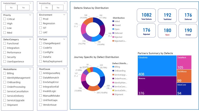
Visual: Defects Status by Distribution (Donut Chart)
This visual displays a donut chart categorizing all 1082 defects into six statuses:
- Closed
- Open
- Deferred
- Rejected
- TestFailed
- RejectedConfirmed
This provides a quick glance at backlog and closure performance. The near-equal share of “Open,” “Rejected,” and “Closed” defects signals workflow inconsistencies. Plese note that the dashboard is fully interactive. User can click on different sections to dig down on any aspect he prefers to focus on.
Check out” 15 Important FAQs about Business Analytics – Exceediance
Visual: Journey-Specific Defect Distribution
Please see above image: This donut chart shows how defects are spread across modules like Billing, Onboarding, ServiceUpgrade, and OrderProcessing.
- Billing (225) and Onboarding (200) have the highest defect counts, likely requiring root cause deep dives or system revamps.
Pro Tip: Use this to identify bottleneck stages in the customer journey.
Check out this: 3 Important Steps – Entrepreneur Business Improvement through Business Intelligence – Exceediance
Visual: Partners Summary by Defects (Treemap)
Please see above image: A vibrant treemap ranks vendors based on defect count:
- Cloudoria: 408
- Nexora: 376
- DataNest: 105
- TechNova: 99
- InnoCore: 94
This enables vendor performance benchmarking — especially useful for SLA evaluations. Check this 50 Most Important KPIs for your Business – Exceediance
Advanced Visuals for Deep Defect Analysis
Visual: Defect Status by Vendor and Priority (Sunburst Chart)
This sunburst chart illustrates defect distribution based on:
- Outer Ring: Priority (Critical, High, Medium, Low)
- Inner Ring: Vendor (Cloudoria, Nexora, TechNova, etc.)
Insight Example: Nexora handles the highest number of critical defects, followed closely by Cloudoria, whereas InnoCore mostly deals with low priority issues.
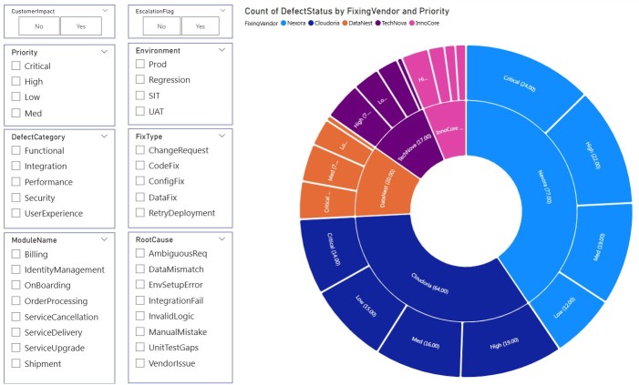
This visual is especially helpful to:
- Align vendor responsibilities with their SLA obligations
- Reallocate QA focus based on defect criticality
Internal Link:
19 Data Analytics Visuals for Stunning Graphs and Charts
Visual: Defect Lifecycle (Sankey Diagram)
The Sankey diagram maps the entire defect journey:
- From origin (Development, Production, UAT)
- Through stages (Testing, New, In Progress)
- To outcomes (Closed, Deferred, Escalated)
The width of each flow represents the number of defects, giving a clear view of where most issues are getting stuck (e.g., “Open” or “In Progress”).
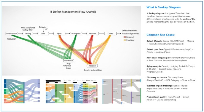
Key advantages:
- Trace root causes to outcomes
- Detect bottlenecks
- Visualize the proportion of deferred vs escalated issues
Check this: Harnessing AI In Power BI Digital Analytics – Exceediance
Decomposition Tree: Root Cause Investigation & Drill-Down
Visual: Decomposition Tree – Count of FixType
This AI-powered decomposition tree allows users to drill down dynamically through multiple hierarchical layers, such as:
- FixingVendor → ReleaseVersion → DefectCategory → Environment → ModuleName → DefectAge
In the image example, DataNest → R1.6 → UserExperience → SIT → Shipment led to a defect aged 22 days.
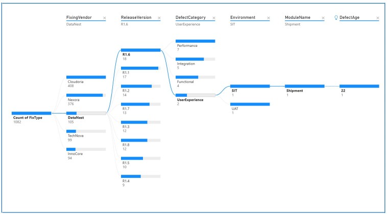
What makes this visual powerful:
- You can choose the next drill-down level interactively, based on either hierarchy or AI-suggested splits
- Root cause analysis becomes intuitive with direct paths to delayed deployments, excessive defect age, or team bottlenecks
- It supports both manual hierarchy and automatic decomposition
Use Case Scenarios
- Track which modules in which release led to longest aging
- Find environments with slow fix validation times
- Identify problematic releases per vendor
Visual: Tree Visual – Drill Down by Vendor, Release, Category, Environment, Module
This multi-level tree view helps users explore:
- Which vendor fixed how many defects
- In which release (R1.1 to R1.8)
- Under which defect categories (UserExperience, Integration, etc.)
Example insight:
“DataNest → R1.6 → UserExperience → SIT → Shipment → DefectAge = 22 days”
This is excellent for drill-through root cause analysis, especially when coupled with filters like Environment or FixType.
Table: Mid-Article Summary of Key Insights
| Visual | Key Purpose | Example Insight |
|---|---|---|
| Sunburst Chart | Vendor vs Priority | Nexora leads in critical defects |
| Sankey Diagram | Lifecycle flow | Majority of defects remain “In Progress” |
| Tree Visual | Drill-down view | R1.6 UserExperience defect aged 22 days |
Priority Trends Across Releases
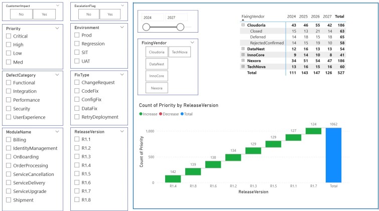
Visual: Count of Priority by ReleaseVersion (Stacked Column)
This visual shows the total number of defects grouped by release version (R1.1 to R1.8) and tagged by increase/decrease in count.
R1.4 and R1.8 appear to have the highest spikes, indicating testing inefficiencies or unstable builds during these phases.
Visual: Table of Vendor Contribution by Year
This matrix shows:
- Vendor-wise yearly totals
- Status grouping (Closed, Deferred, Rejected)
- Cumulative defect contribution (2024–2027)
Helpful for quarterly audits, vendor reviews, and targeted improvements.
Ordered List: When to Use These Visuals
- Sunburst Chart – For vendor SLA monitoring
- Sankey Diagram – For tracing complex defect paths
- Tree View – For granular investigations by release/module
- Priority Trends Chart – For identifying problematic releases
- Vendor Table – For resource planning and closure forecasting
Reporter Trends, Infographics & Deep Analysis Tools
Visual: Top and Bottom 10 Issue Reporters (Word Clouds + Tables)
This side-by-side layout shows:
- Top 10 reporters: Omar, Saad, Harry, Laila, Zainab, etc.
- Bottom 10 reporters: Tariq, Usman, Desai, Priya, Faisal, etc.
Insight Example: Omar and Harry reported over 190 defects combined, suggesting high awareness or module instability in their teams.
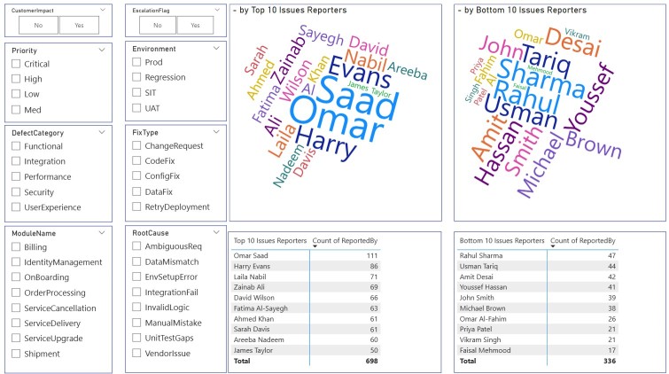
This helps:
- Identify proactive teams
- Trace under-reporting patterns
- Encourage knowledge sharing among QA/reporting teams
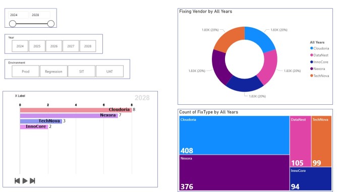
Visual: Fixing Vendors – Multi-Year Summary
This section combines:
- Donut charts and bar graphs (FixType and Vendor count over years)
- Timeline filters (2024–2028) and Environment slicers
You’ll notice Cloudoria and Nexora consistently dominate the volume across years—highlighting the need for strategic collaboration and potentially contract renegotiation or team augmentation.
Visual: Heatmap – Validation & Deployment Timelines
This section showcases:
- Validation Time by Priority (heatmap)
- Deploy Time by Year & Priority (stacked bar + donut + table)
Notable insight:
Medium priority defects have the longest validation and deploy time, peaking at 28.06 days in 2028.
Why It Matters: Often, medium-priority defects are overlooked despite their cumulative risk. This chart helps balance focus between critical and mid-level issues.
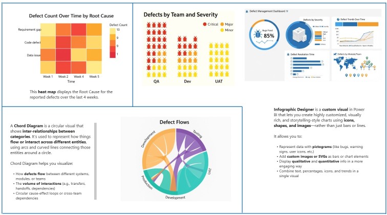
Visuals: Infographic Designer, Chord Diagram, Defect Trends
These custom visuals stand out in visual storytelling:
- Infographic Designer: Uses icons, shapes, and pictograms to:
- Show bug trends
- Visualize module severity
- Highlight resolution times
- Chord Diagram: Represents interdependencies and defect flow across QA → Dev → UAT → Production
- Defect Count by Root Cause (Heatmap):
- Reveals patterns like “Code Defect” peaking in Week 2
- Helps spot recurring issues over time
Please see above diagram that provides visual for Infographic Designer, Chord Diagram, Defect Trends
Final Takeaway Table
| Visual | Use Case | Strategic Benefit |
|---|---|---|
| Word Clouds | Reporter Activity | Identify proactive/underperforming teams |
| Heatmaps | Time trends | Track delays in validation & deployment |
| Chord/Sankey | Interconnected flow | Map cross-team dependencies |
| Infographics | Storytelling | Communicate trends to non-technical stakeholders |
Watch this in Action – Video Walkthrough
More Visuals Possible? Yes ! Absolutely !
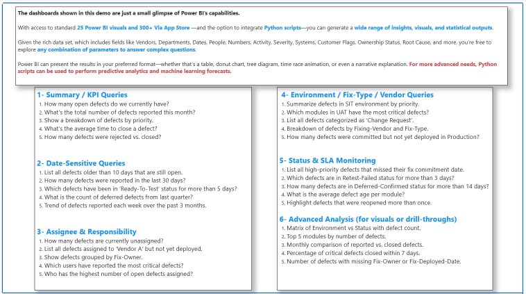
This Power BI dashboard isn’t just a visual presentation tool — it’s a powerful query engine that lets you answer real-world questions across different dimensions of defect management. Thanks to over 25 visual types, custom slicers, and Python integration, you can perform deep-dive analyses across multiple domains. Run Python scripts in Power BI Desktop – Power BI | Microsoft Learn Also see Advice please: How do you use Power bi & Python? : r/PowerBI
The dashboard supports dynamic queries across vendors, dates, fix owners, environments, and defect types — turning it into a full-fledged analytics solution.
Sample Business & Technical Questions You Can Answer
1. Summary / KPI Queries
- How many open defects are currently pending?
- What’s the total number of defects reported this month?
- What’s the average time to close a defect?
- How many defects were rejected vs. closed?
2. Date-Sensitive Queries
- Which defects have been open for more than 10 days?
- How many were reported in the past 30 days?
- What’s the trend of weekly defect volume over the past 3 months?
3. Assignee & Responsibility Queries
- Who are the top and bottom defect reporters?
- How many defects are still unassigned?
- Which vendors have uncommitted or untested fixes?
4. Environment / Fix-Type / Vendor Queries
- How many defects exist in SIT/UAT/Production?
- Which modules have the most critical issues?
- What’s the defect load per FixType and Vendor?
5. Status & SLA Monitoring
- Which high-priority defects missed their fix deadlines?
- Which defects stayed in “Retest-Failed” for too long?
- How many were reopened multiple times?
6. Advanced & Predictive Analytics
- Detection of SLA breaches before they happen
- Matrix of environment vs defect status
- Percentage of critical defects closed within 7 days
- Use of Python scripts to forecast defect volume by week or month
Conclusion: Why This Dashboard Stands Out
This Defect Management Dashboard in Power BI demonstrates:
- Full lifecycle visualization of defects (from detection to closure)
- Real-time tracking of vendor SLAs, defect priorities, validation lags
- High customizability with slicers (Environment, FixType, Root Cause, etc.)
- Effective storytelling through Sankey, Chord, Infographic, and heatmap visuals
- Potential integration with Python scripts for automated insights and forecasting
Whether you’re a QA lead, PMO, or vendor manager, this dashboard is your central intelligence hub for data-driven defect control.
“If you’re looking to enhance your IT defects management dashboard with even more powerful visuals, real-time insights, or seamless integrations, consider exploring DataBox. This intuitive business analytics platform helps teams track KPIs, automate reporting, and gain deeper visibility into their data—all in one place. To learn more about how DataBox can elevate your analytics workflow, check out this detailed overview: Business Analytics Platform – DataBox. Ready to get started? Sign up through our affiliate link here: DataBox.”
Disclaimer:
All data, including individual names, company names, and associated details displayed in this dashboard, is entirely fictitious and has been artificially generated. This content is created exclusively for educational and demonstrative purposes to showcase the capabilities of Business Intelligence tools such as Power BI.
No part of this dashboard reflects real individuals, organizations, or real-world data. Any resemblance to actual persons, living or dead, or to real companies is purely coincidental.
The creator of this dashboard assumes no legal responsibility or liability for any interpretation, misuse, or reliance placed upon the content displayed.
If you believe any portion of this content raises a valid concern, you may contact the editor at editor@exceediance.com or mjunaidtahir @ gmail . com.
Please note that while all messages will be reviewed, no guarantees are made regarding changes or content removal.
Contact the Developer
Let’s Connect !
If you liked this article and want to learn Power BI, develop a customized dashboard, or hire me as your BI consultant to bring your data to life — I’m here to help!
I have built interactive dashboards across a variety of industries — tailored to business needs, KPIs, and technical complexity.
2 comments
[…] IT Defects Management Dashboard Power BI Template Stunning Visuals – Exceediance […]
[…] IT Defects Management Dashboard Power BI Template Stunning Visuals – Exceediance […]
Comments are closed.