
Dashboard Pro: A Free, Browser-Based Analytics Dashboard Generator
Dashboard Pro is a self-contained, interactive analytics dashboard that runs entirely in your browser — no software installs, no server, no data ever leaving your device. Open the file, load your data, and get an instant, professional-grade view of your numbers: KPI cards, trend charts, breakdowns by category and region, and export-ready visuals, all in one place. Browser-Based Analytics Dashboard Generator
It’s built for anyone who needs a quick, polished way to explore business data — project costs, product performance, regional sales, quality scores — without setting up a full BI platform.
What you can upload
Dashboard Pro works with a simple 8-column structure, split across three data types:
| Type | Columns | Example |
|---|---|---|
| Text | Product, Category, Region | “Laptop”, “Electronics”, “Dubai” |
| Date | StartDate, EndDate | 2024-02-05 |
| Number | Cost, Score, KPIValue | 3200, 96, 22000 |
You can upload your own data as an .xlsx, .xls, or .csv file. If your column names or order don’t match exactly, the dashboard shows a mapping screen where you tell it which of your columns should be treated as text, date, or number — it then slots them into the right place automatically.
To keep things fast and the browser responsive, uploads are capped at 8 fields and 100 rows. If your file is larger, the dashboard will use the first 8 columns and first 100 rows and let you know.
No file handy? A “Load sample data” button drops in a ready-made 25-row dataset so you can explore every feature immediately.
Exploring your data with slicers
The real value of the dashboard is in how quickly you can slice and re-slice the same dataset:
- Region, Category, and Product filters — click-to-toggle chips let you isolate any combination (e.g., just “Dubai” and “Electronics”).
- Date range — pick a From/To window to focus on a specific period.
- Numeric range sliders — drag to cap Cost, Score, or KPI Value and instantly narrow the view to the range you care about.
- Reset Filters — one click restores the full dataset.
Every chart and KPI card updates live as you adjust filters — there’s no “refresh” button, and no page reload.
What you’ll see
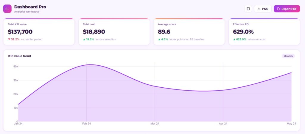
- KPI cards — total KPI value, total cost, average score, and effective ROI, each with a trend indicator comparing earlier vs. later periods in your filtered data.
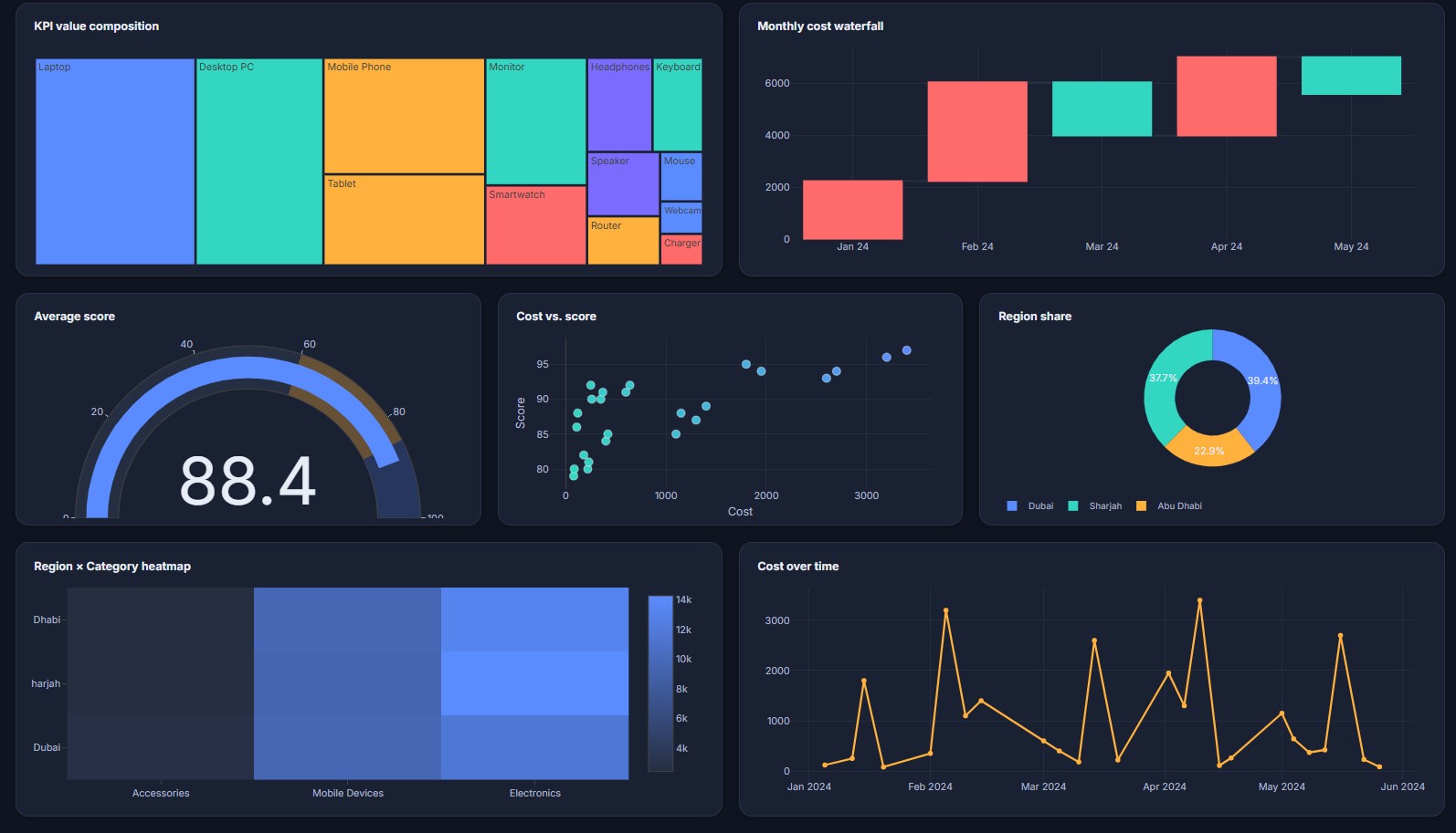
- Ten-plus visualizations — a KPI trend area chart, cost-by-category bar chart, a Region → Category → Product sunburst, a treemap, a monthly cost waterfall, a score gauge, a cost-vs-score scatter plot, a region share donut, a Region × Category heatmap, and a cost-over-time line chart.
- Five visual themes — Corporate Blue-Teal, Vibrant Purple-Pink, Dark Mode Neon, Minimal Grayscale, and the signature Dashboard Pro theme — switchable instantly from the side panel.
- One-click export — download the whole dashboard as a high-resolution PNG or a PDF, ready to drop into a report or presentation.
Some Snapshots from the Dashboard
High Level Cards / Visuals
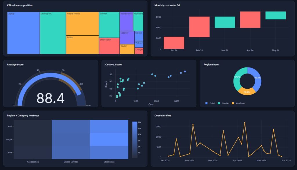
Black Theme
The dashboard offers 5 different theme to choose from.
Left panel provides slicers to interact with data
PNG and PDF export functionality also provided.
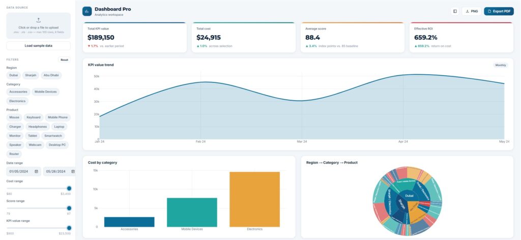
The Dashboard
See Dashboard Pro in Action
Click the button below to explore a live, interactive dashboard. Use the left panel to filter by region, category, product, date, or value range — and hover over any chart to reveal exact values and percentages.
🚀 Launch the DashboardSome Recommended Resources To Explore
- Power BI Contents- Exceediance
- Create An Awesome Procurement Analytics Dashboard Using ChatGPT in 10 Minutes – Exceediance
- FREE Heat Map Tool For Risk Management – 6 Excellent Templates – Exceediance
Want something built around your own data?
This dashboard is a general-purpose starting point. If you’d like a custom dashboard — whether browser-based like this one, built natively in Power BI, or set up as an interactive Excel workbook — get in touch with Junaid Tahir to discuss your requirements.