Running a school business effectively requires the establishment of right databases and data management systems. As the school business grows, the data size keeps increasing, making it more complex to get insightful summaries for better management of the business and to make effective decisions. These Power BI Dashboard for School with 8 Visuals will definitely help you to achieve your business ambitions.
Table of Contents
Power BI Dashboard for School – Visuals Summary
Below are 15 School Management Dashboards for Your Business covering so many features with endless possibilities:
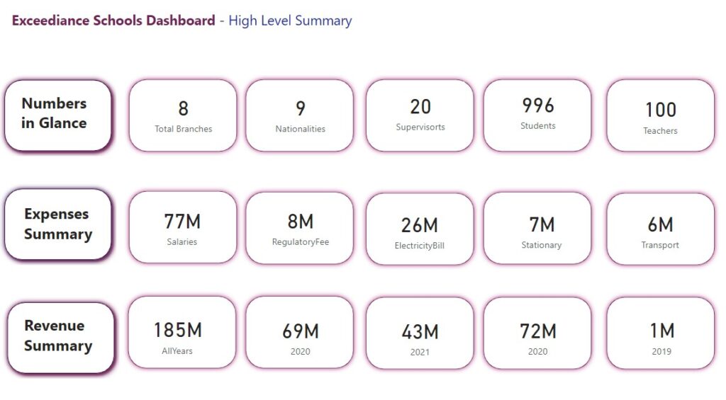
- High Level Summary – Number of teachers, students and supervisors.
- Nationality based interactive filter for students, suppliers, teachers, drivers and all staff.
- Role based summaries.
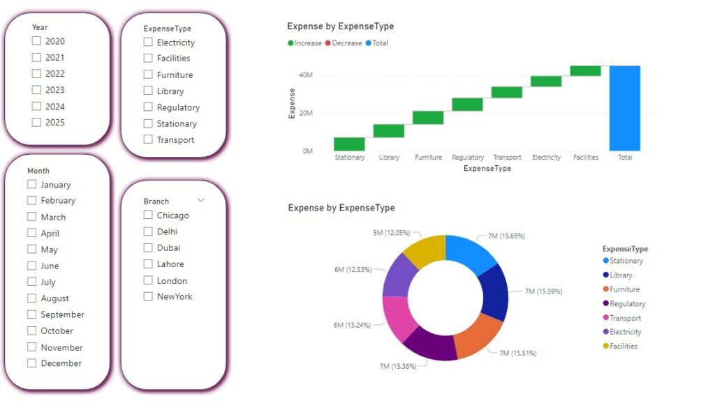
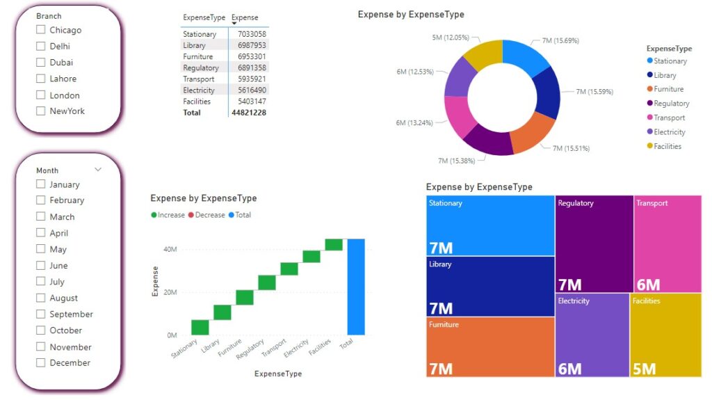
- Cost and Expense analysis – week by week, month by month, year by year analysis. Graphs, charts, tables and so on.
- Paginated reports, export to PDF and PPT.
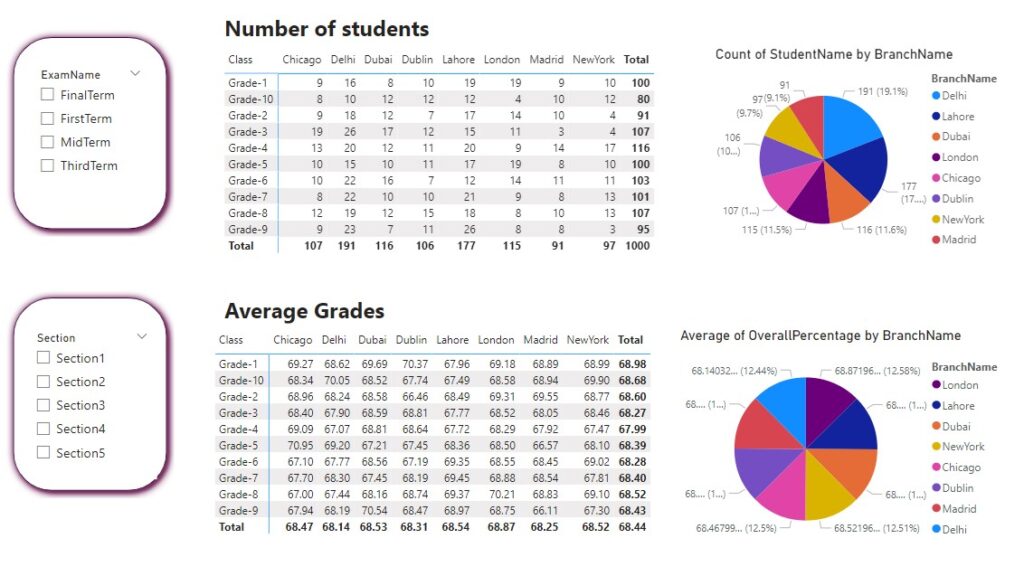
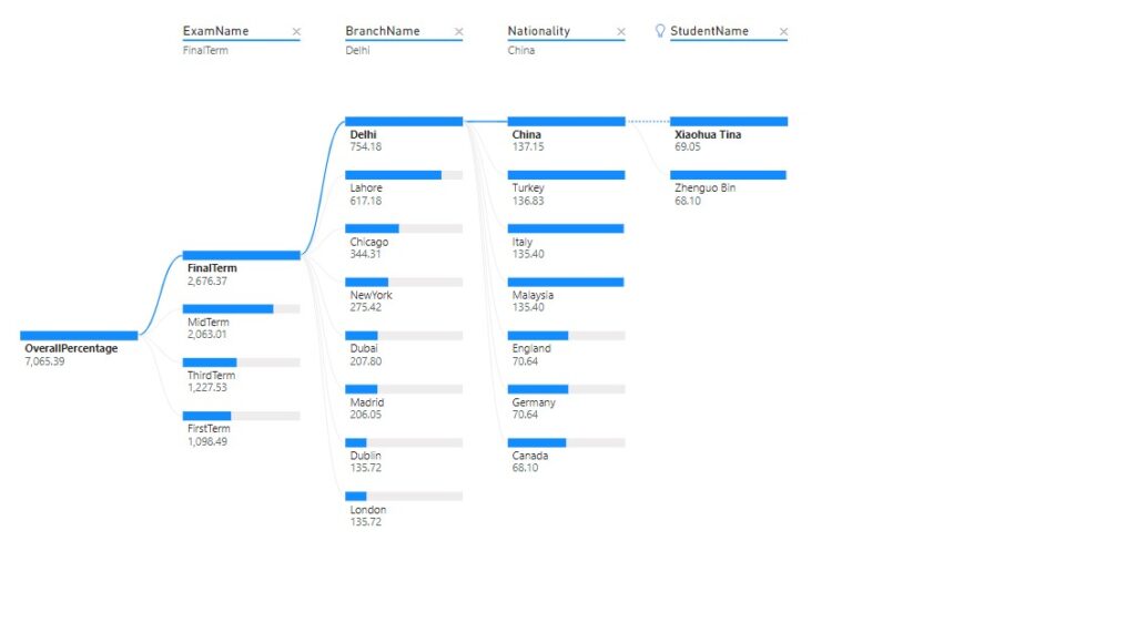
- Top Ten students ranking based on subjects, branch, nationality, city, semester, class, sections and more..
- Expense summary breakdown and deep analysis. High-cost triggers and alerts.
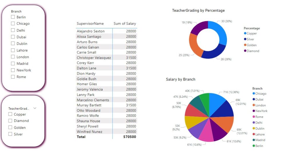
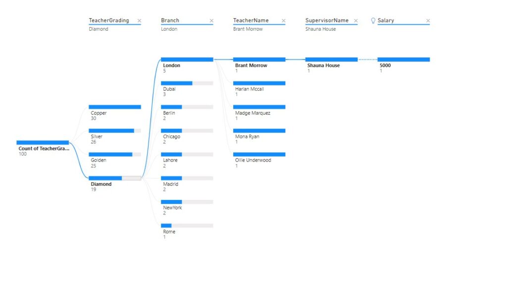
- Teacher performance ranking.
- Attendance summary for all staff.
- Salary reports and graphs – Pie chart, Bar chart, donut chart, live filters, slicers and more.
- Super Awesome degenerative graphs to interact with all kinds of data and extracting live information for any aspect related to school management.
- Tree graph, funnel graphs related to KPIs, expenses, revenues and profits to help leaders understand the overall trends, revenue leakages, business opportunities and for other business intelligence-based decisions.
- Identification of poor performing teachers, students, class, sections to enable making right decisions for improvement.
- Financial leakage identification.
- Checking out all reports via mobile app on the go.
Power BI Dashboard for School – 8 Visuals
Need More Features On Your Power BI Dashboard for School?
Depending upon the needs of the school, there are so many aspects that you can create dashboards for managing your school business. Check out these examples:
- Student Enrollment Trends
- Demographic Analysis of Students
- Attendance Rates and Patterns
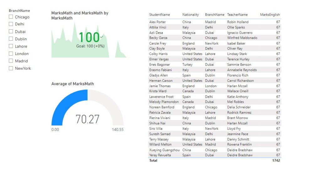
- Academic Performance Metrics
- Teacher-to-Student Ratio
- Curriculum Coverage and Progress
- Classroom Utilization Rates
- Discipline Incidents and Trends
- Parental Engagement Metrics
- Extracurricular Activity Participation
- Teacher Performance and Professional Development
- Resource Allocation and Budget Utilization
- School Infrastructure and Maintenance Status
- Health and Wellness Programs Participation
- Special Education Program Effectiveness
- Graduation Rates and College Placement
- Technology Integration in Education
- Library Utilization and Resources
- Transportation Efficiency and Safety
- School Security and Emergency Preparedness
- Feedback and Surveys from Students and Parents
- Community Outreach and Partnerships
- Financial Aid and Scholarship Allocation
- Alumni Engagement and Contributions
- School Rankings and Accreditation Status
This is just the glimpse of what can be done using Microsoft Power BI. However, on a general note, whatever you can think of in terms of extracting specific information (cost wise, number wise, date wise etc.) and displaying (graphs, charts, comparison tables, funnels, time based videos etc.) is absolutely possible. Please contact us
Lets Boost Your Business With Exceediance
At Exceediance, we understand that every business is unique, with distinct needs and aspirations. We invite you to connect with our dedicated team for a personalized consultation that delves into your specific business requirements. Our experts are eager to engage in a meaningful conversation about your objectives and challenges, with the goal of crafting tailored dashboards that can truly elevate your business. By collaborating closely with you, we aim to design insightful and user-friendly tools that provide real-time visibility into key metrics, drive informed decision-making, and propel your business towards greater success.
Let’s embark on this journey together — schedule a meeting with our team today, and let’s shape the future of your business through the power of data-driven insights
2 comments
[…] Starting a home-based childcare business requires careful planning and dedication, but it can lead to a fulfilling career supporting the development of children. By following these steps and staying committed to providing quality care, you’ll establish a nurturing and successful home childcare environment. If you would like to consider advanced tools and techniques for Business Intelligence and take your school business to new heights, Business Intelligence Dashboard for Schools with 8 Beneficial Visuals […]
[…] Data-Driven Insights: AI can analyze student performance data over time, offering teachers valuable insights into trends, such as which topics students are struggling with or excelling in, allowing for targeted interventions. Power BI Dashboard for School with 8 Beneficial Visuals – Exceediance […]